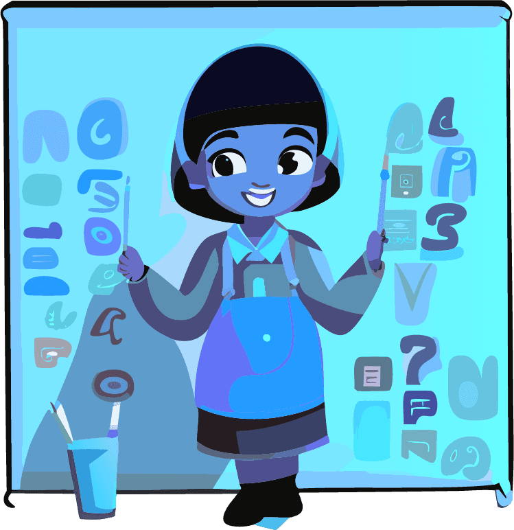

Energy Kidz Brand Book: Typography Guidelines
Primary Typeface: Kidglows
Embracing Childhood Creativity Kidglows, as our primary typeface, is at the heart of Energy Kidz's visual identity, embodying the spirit of playfulness and imagination that we nurture in every child. Its whimsical, hand-drawn qualities reflect our commitment to fostering a creative, vibrant, and welcoming environment. Kidglows is versatile, perfect for headings, titles, and any text that requires a touch of warmth and friendliness. When using Kidglows, we ensure that the text remains legible and engaging, encapsulating the essence of childhood wonder in every word.

Secondary Typeface: Impact
Conveying Strength and Clarity Impact serves as our secondary typeface, providing a strong and clear counterpoint to the playfulness of Kidglows. Known for its boldness and readability, Impact is used for subheadings, call-to-actions, and important messages that require emphasis. This typeface complements Kidglows by bringing balance and structure to our visual communications, ensuring that our messages are both engaging and authoritative. The use of Impact is carefully measured to maintain harmony in our designs, reinforcing the Energy Kidz brand as both friendly and dependable.

Typography in Use
Creating Cohesive Communications In our brand communications, the interplay between Kidglows and Impact is carefully considered to create a cohesive and engaging visual hierarchy. Kidglows invites our audience into a world of imagination and play, while Impact grounds our messages with a sense of purpose and clarity. This dynamic ensures that our communications are not only visually appealing but also effectively convey the key values and messages of Energy Kidz. From marketing materials to digital content, the thoughtful use of typography enhances readability, engagement, and brand recognition.
Best Practices for Typography
Ensuring Consistency and Impact To maintain consistency across all Energy Kidz materials, specific guidelines govern the use of Kidglows and Impact. For Kidglows, attention is given to spacing, size, and color to maximize legibility while preserving its playful character. Impact is used sparingly to draw attention without overwhelming the design. We also consider the context in which these typefaces are used, ensuring they are appropriate for the intended audience and message. By adhering to these best practices, Energy Kidz maintains a strong and consistent brand identity that resonates with families and children alike.
Energy Kidz Brand Book: Typography Guidelines
Primary Typeface: Kidglows
Embracing Childhood Creativity Kidglows, as our primary typeface, is at the heart of Energy Kidz's visual identity, embodying the spirit of playfulness and imagination that we nurture in every child. Its whimsical, hand-drawn qualities reflect our commitment to fostering a creative, vibrant, and welcoming environment. Kidglows is versatile, perfect for headings, titles, and any text that requires a touch of warmth and friendliness. When using Kidglows, we ensure that the text remains legible and engaging, encapsulating the essence of childhood wonder in every word.

Secondary Typeface: Impact
Conveying Strength and Clarity Impact serves as our secondary typeface, providing a strong and clear counterpoint to the playfulness of Kidglows. Known for its boldness and readability, Impact is used for subheadings, call-to-actions, and important messages that require emphasis. This typeface complements Kidglows by bringing balance and structure to our visual communications, ensuring that our messages are both engaging and authoritative. The use of Impact is carefully measured to maintain harmony in our designs, reinforcing the Energy Kidz brand as both friendly and dependable.

Typography in Use
Creating Cohesive Communications In our brand communications, the interplay between Kidglows and Impact is carefully considered to create a cohesive and engaging visual hierarchy. Kidglows invites our audience into a world of imagination and play, while Impact grounds our messages with a sense of purpose and clarity. This dynamic ensures that our communications are not only visually appealing but also effectively convey the key values and messages of Energy Kidz. From marketing materials to digital content, the thoughtful use of typography enhances readability, engagement, and brand recognition.
Best Practices for Typography
Ensuring Consistency and Impact To maintain consistency across all Energy Kidz materials, specific guidelines govern the use of Kidglows and Impact. For Kidglows, attention is given to spacing, size, and color to maximize legibility while preserving its playful character. Impact is used sparingly to draw attention without overwhelming the design. We also consider the context in which these typefaces are used, ensuring they are appropriate for the intended audience and message. By adhering to these best practices, Energy Kidz maintains a strong and consistent brand identity that resonates with families and children alike.
Energy Kidz Brand Book: Typography Guidelines
Primary Typeface: Kidglows
Embracing Childhood Creativity Kidglows, as our primary typeface, is at the heart of Energy Kidz's visual identity, embodying the spirit of playfulness and imagination that we nurture in every child. Its whimsical, hand-drawn qualities reflect our commitment to fostering a creative, vibrant, and welcoming environment. Kidglows is versatile, perfect for headings, titles, and any text that requires a touch of warmth and friendliness. When using Kidglows, we ensure that the text remains legible and engaging, encapsulating the essence of childhood wonder in every word.

Secondary Typeface: Impact
Conveying Strength and Clarity Impact serves as our secondary typeface, providing a strong and clear counterpoint to the playfulness of Kidglows. Known for its boldness and readability, Impact is used for subheadings, call-to-actions, and important messages that require emphasis. This typeface complements Kidglows by bringing balance and structure to our visual communications, ensuring that our messages are both engaging and authoritative. The use of Impact is carefully measured to maintain harmony in our designs, reinforcing the Energy Kidz brand as both friendly and dependable.

Typography in Use
Creating Cohesive Communications In our brand communications, the interplay between Kidglows and Impact is carefully considered to create a cohesive and engaging visual hierarchy. Kidglows invites our audience into a world of imagination and play, while Impact grounds our messages with a sense of purpose and clarity. This dynamic ensures that our communications are not only visually appealing but also effectively convey the key values and messages of Energy Kidz. From marketing materials to digital content, the thoughtful use of typography enhances readability, engagement, and brand recognition.
Best Practices for Typography
Ensuring Consistency and Impact To maintain consistency across all Energy Kidz materials, specific guidelines govern the use of Kidglows and Impact. For Kidglows, attention is given to spacing, size, and color to maximize legibility while preserving its playful character. Impact is used sparingly to draw attention without overwhelming the design. We also consider the context in which these typefaces are used, ensuring they are appropriate for the intended audience and message. By adhering to these best practices, Energy Kidz maintains a strong and consistent brand identity that resonates with families and children alike.
